Greenhouse Effect
Trends in atmospheric CO2
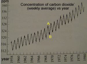
The average weekly concentration of atmospheric carbon dioxide, in parts per million, is plotted on the graph shown on the right. These results were recorded at Mauna Loa Observatory, Hawaii. Yearly fluctuations are due to seasonal differences due to photosynthesis.
Extrapolate the graph
and predict the concentration of atmospheric CO2 for the year
1990.
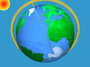
Consider the animation on the right. It shows our planet spinning on its axis. Australia can be found in the Southern hemisphere. The sun is pictured on the top left corner.
Consider the North and South hemispheres. Which one has the most abundant vegetation?
Which hemisphere is experiencing summer?
The graph of average weekly
concentration of atmospheric carbon dioxide is shown above for the years
between 1958 and 1980. The point marked "B" represents summer
of 1969 in which hemisphere? Explain.